Context
In 2023, WhatsApp wanted to provide a convenient and quick way to record and send short, real-time and expressive video messages to your loved ones.
From the composer in a chat, users long press on the camera icon to record and send a short (1 minute-max), circular video message.
The issue with the 2023 MVP launch was that users reportedly said in user tickets that they did not know where we first put the entrypoint, which was to tap on the mic icon to turn it into a camera icon and then long press the camera. Video messages were also hard to naturally discover; user research indicated that users had no idea our feature existed.
Business and content goals
We had to boost discovery of PTV by introducing it to new users in a way that:
- Educate on how to try it (hold and press the camera).
- Described what the feature was and its benefits (you can more quickly record and send video messages).
- Grabbed people's attention, with arresting language like “New!” or with an icon
Principles
- Brevity: I communicated with minimal, snappy language to fit all the info into a small tooltip and say all the important details before I lost users' attention.
- Clarity: I had to clearly explain what this feature was and how to use it.
- Compelling: I had to grab people's attention and draw them in with compelling, exclamatory, or benefit-led language.
Tones
- Affirmative: I sought to sound positive and upbeat to get users intrigued quickly, as tooltips are notorious for being ignored.
- Informative: I wanted to be direct and fit the most important info in a small space.
Tooltip explorations
I wrote versions that tried to fulfill the aforementioned goals. The following versions went to the Archive because they scored low on the criteria I created out of those goals.
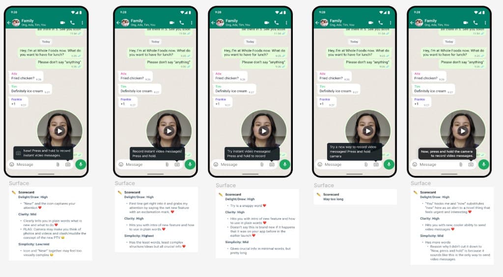
It came down to three options that were the most compelling, explanatory and brief.
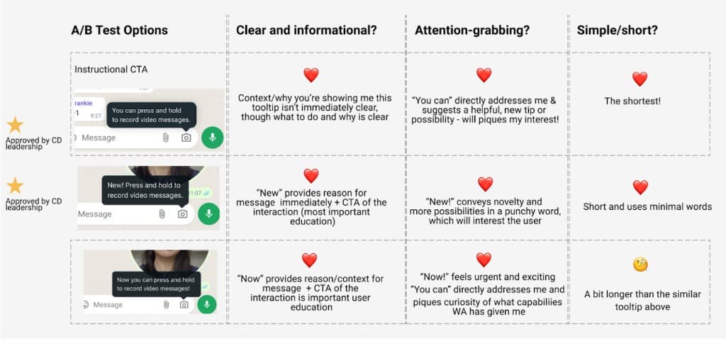
After getting feedback from my content design director, marketing teams, product manager, design leads, user research stakeholders, and content reviewers, we chose to test “You can press and hold to record video messages” and “New! Press and hold to record video messages.”
We decided that the striking exclamation “New!” and addressing the user directly with “You can” were the most powerful ways to get a user to pay attention to a tooltip. The explanatory description after felt concise and comprehensive for both as well.
The engineering team conducted an A/B test of these tooltips with a segment of users upon relaunch to see which tooltip was associated with more video message sends. The performance metrics we could log with WhatsApp's user data collection model was how many video message sends happened within the user population that got the first tooltip versus the users who got the second tooltip.
Results
The version with “New!” (Android: +14%, iOS: +7%) performed consistently better than the version with “You can…” (Android: +7%, iOS: +5%) on both app platforms. So, the team increased the roll out with the higher performing language.
The video messaging team was struck by how much words impact the bottom line, as 7% reflected thousands of users in our A/B test.