Problem
WhatsApp's call survey only had four answers to choose from and covered less than 35% of bad use cases. Users could not report many common calling issues. Thus, the call quality engineering team could not be notified of or fix quality issues. Bad calling experiences abounded — unaddressed.
Objectives
- Collaborate with product design to keep the survey UI looking simple and engaging even with the added load of text.
- Use the most human, simple and common terms to describe technical audio and video issues so all users can more easily read and engage with the survey. More participation means more insights for our engineering teams to act on.
- Add more answer options to cover 99% of common quality issues on the survey.
Old call survey
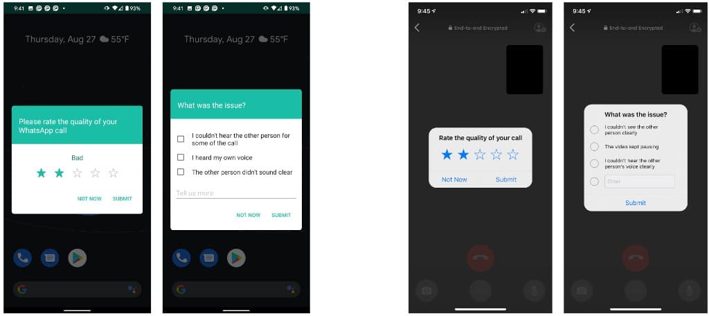
Android version (left) and the iOS version (right)
New call survey
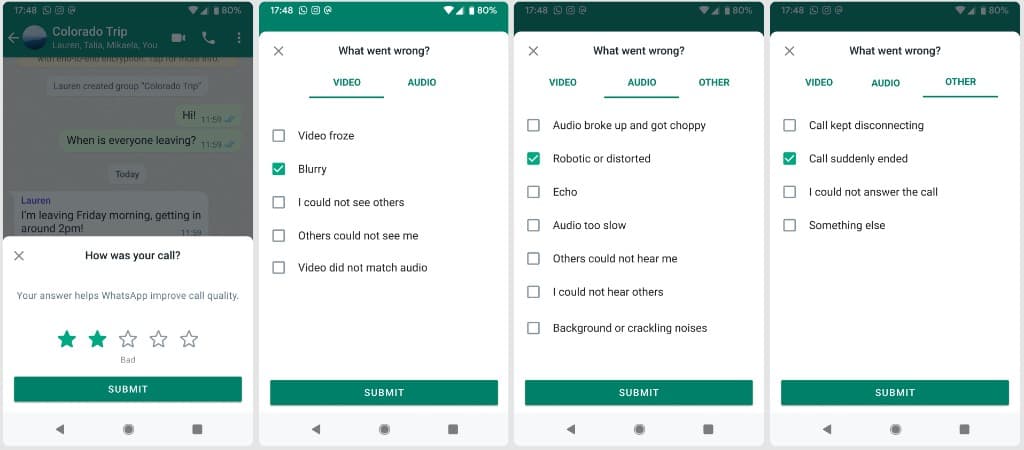
Android version
Changes I made
I added 13 more answer options.
I changed the stiff and technical copy (“Please rate the quality of your call” and “What was your issue?) to say “How was your call?” and “What went wrong?” to make the tone more conversational, empathetic, and inviting.
I added “Your answer helps WhatsApp improve call quality” to encourage users to participate and impact our app.
How I made them
The 13 new options: WhatsApp's data science team went through all freeform user feedback ever submitted through the old survey and provided me with a list of the most common issues users wrote: “Keeps reconnecting,” “Network problem/poor connection,” “Call unexpectedly ended,” “Blurry Image,” “Can't hear/see the other person,” “The other person can't hear/see me,” “Lags,” “Noise,” “Call didn't connect,” and more.
The call quality engineering manager and I determined which issues came up the most and needed to be on the survey. I wrote a list of thirteen and made each answer option as short as possible so users can scan and finish the survey quickly. I ran my copy with the user report data scientists and UXR researchers and reiterated based on their feedback to ensure I was speaking in the same language as our users.
The new copy: I knew the greeting copy needed work after hearing from the data science team that out of 52 million call rating submitters, only 4% of them participated in the survey. I conducted user research sessions with the UXR team to understand the reasons for this drop-off at the first step. We discovered it was because users did not think their answers mattered and found the copy unfriendly.
I let users know why their answers mattered in the copy and changed the tone in direct response to what our users said.
Design considerations
I capped the answer options to thirteen because the survey UI looked dense and intimidating when we tried to add more.
I collaborated with product design to create a new tab UI that allowed us to add significantly more content in a visually appealing, organized way.
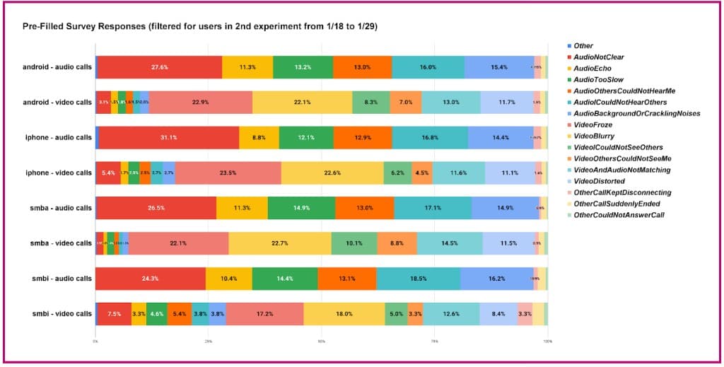
Impact
The new survey unlocked deeper insights for the quality engineering team to explore.
Significantly more new issues were reported. Call rating were higher overall.